A New Look Representing the Importance of Quality Medication Use
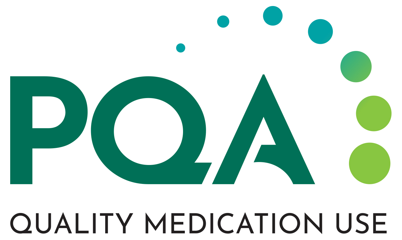 PQA has a new look! Our fresh and modernized logo and color scheme reflect our positive, forward-looking view of the vital role of medications in health care – and our role in bringing the industry together to improve quality.
PQA is proud to be the national association that unites the health care industry in support of quality medication use. We know that the safe, appropriate and effective use of medications is an essential part of preventing disease, managing chronic conditions and supporting overall long-term health, well-being and positive patient outcomes.
PQA’s reputation within the healthcare system remains stellar and synonymous with consensus-driven work to improve health care outcomes through high-quality medication use. That’s why “PQA” remains central to our image, identity and logo.
Through measurement, research, education and convening, everything we do drives towards quality medication use, which is our logo’s new tagline.
You’ll also notice a new element in our logo: a set of circles. They represent how our diverse members come together through PQA to build consensus. And everything originates from or leads to the “Q” in PQA – quality.
This is the first major update to PQA’s look since the organization was established in 2006. Our name, our mission and our identity remain unchanged, and we continue to evolve from a position of strength.
In partnership with our 240 member organizations from across health care, we will continue to advance and communicate the value that performance measurement and related medication use quality initiatives bring to the health care system for improving care and outcomes.
Thank you for your continued support and engagement with PQA. I hope that you share my excitement about our new logo and its representation of our vital work together.