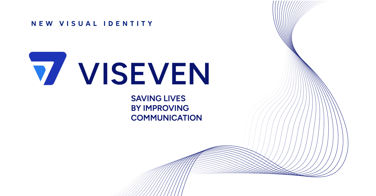
Viseven, a leading MarTech services provider in the pharma industry, announces a new brand identity. The brand refresh is now in effect across the company’s social media platforms.
This strategic decision stems from the company’s transformation and strong ambition to revolutionize the pharmaceutical market.
Nataliya Andreychuk, CEO of Viseven, shared the exciting news, underlining that adjustments to the brand identity highlight the commitment to staying abreast of market trends and assisting clients in navigating the ever-changing industry landscape.
“Viseven’s transformation is not just about a new look or aesthetics. It’s a reflection of our evolution as a company and getting closer to partners around the world, continuing our mission of saving lives by improving communication. Over the past 14 years, Viseven has been growing and evolving, guiding clients on their unique journeys. It feels like the perfect, organic moment for our update. And that’s just the first step; in 2024, we are ready for even more thrilling transformations,” says Andreychuk.
The selected logo signifies a prominent change from the prior design. Unlike the old logo, where the blue ‘V’ represented the company’s initial letter, the revamped version can be interpreted as either the number 7 or the upward-pointing arrow symbol.
The purpose of this logo is twofold – to reflect an element of the brand name and to showcase the company’s focus on continued growth, technological innovation, and expertise.
“Viseven is a leader in digital transformation, and today, we prove that time does not stand still. Our company is growing and evolving. As a prominent pharma and life sciences marketing player, it’s time to unveil a more sophisticated brand identity. I like to think of it as a fresh pair of wings propelling Viseven to new heights,” claims Yuliya Sotska, Chief Brand & Communications Officer at Viseven.
Over the last decade, Viseven has evolved into a global company, catering to clients from over 50 countries. Creating a more universal logo was a natural move, pinpointing Viseven’s international footprint and familiarity to customers worldwide.
Rather than entirely forsaking the prior color scheme, the primary and secondary colors (royal and light turquoise blue, respectively) have been retained. The design team enhanced the shades by increasing their brightness, thereby bringing a subtle yet powerful refinement to the previous image.
The refreshed brand identity move mirrors the company’s desire to preserve its legacy while embracing innovation to meet the rising needs of its clients. The chosen color palette is intended to amplify the brand’s trustworthiness, reinforcing the sense of authority and confidence.
About Viseven
Viseven is a future-inspired global MarTech Services Provider for Pharma and Life Sciences industries with more than a decade of experience.
Viseven’s digital transformation center offers innovative solutions for companies of different sizes and digital maturity levels by merging marketing and digital technology expertise with innovation and strategic capabilities.
The company’s solutions, products, and services are actively used by the TOP 100 Pharma and Life Sciences companies in more than 50 countries around the globe.
Follow Viseven on social media: LinkedIn, Twitter, YouTube, and Facebook.

